
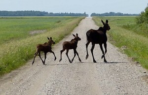
The moose migration is in full swing. Watch this space for news about site changes.
Current:
Recap of known site theme issues/concerns:
– The front page posts needs to be broken into two groups: featured posts (selected by editors) and everything else. We are reviewing other themes now. Until we settle on something, all new posts will post on top and roll the old posts down. We may manually adjust the date/time on the posts to keep the most important ones on top.
– Fonts and colors: The default font is too thin, needs more purple.
– The header area (logo and size) is still going through some transformations. There are some limitations as to what we can do there.
– The commenting system needs ratings and the comment box needs a different look: it is too big and fills the screen with unnecessary white space. Also, there is a need to track replies.
Site Change Log:
Thursday, May 14 we installed a new theme, MH Magazine Lite (you can view a demo at the link.) There were many problems with it, the most critical being that it did not allow us to resize our reading area.
Wednesday, May 13 at 1pm Eastern we changed out the front page to test a Static Front Page. It was immediately reverted.
Awww JanF you make a marvelous momma Moose.
I really like we can edit comments. Really like that.
What do you think about our moose in the canoe paddling Forward? Dee thought we needed more purple and loves that moose. Do you think the bear confuses the issue? It certainly gives us more opportunity for puns. Maybe the bear is Bear-nie Sanders, helping to steer us in the right direction?
I like the moose and bear graphic. It sort of reminds me that enemies can be friends working for a common goal. Besides, it’s very cute!
I also thought it depicted a “working together” theme, very Moosish!
Portlaw, you have an eye for art … I am trying to balance the banner header elements and I have spent so much time staring at it that I am no longer seeing it.
I sense that the bear and moose in the banner need to be smaller but I am trying to figure out what to size them to. Maybe the height of the moose head in fogiv’s logo? Maybe it is okay the way it is?
I thought I had answered this but guess not. I have a terrible eye so you might want to poll other migrating Meese or New to the Herd Meese. It looks good. Maybe the canoe could be lowered a bit, closer to the lower border> Trying to visualize it but no luck. Maybe leave as is
I think that is what I was sensing: the canoe needs to come down a smidgeon, maybe with the tip of the oars lining up with the bottom of fogiv’s moosehead circle. I will try that and see what it looks like.
I think that would work!
I’d maybe put Fog’s Moose logo on the left of the header. Moose logo first thing being seen seems a good thing to me.
Also, with the header…could it be smaller? It is taking up A LOT of real estate.
Fonts and colors need help, as already mentioned. Same Moose fonts/colors ought not be hard to generate, no? Again, the closer to OG Moose the better (IMO).
Figuring out a way to see “New” posts on a comment thread would be waaaaaaaaay helpful. The clicking back and forth with the ‘workaround’ will likely just keep me from bothering to read further.
Pretty much, my opinion is…the closer to original look the better. It is easy to navigate, easy on the eyes, and familiar (and comfortable). The less clutter and ‘noise’ the better. I’m a fan of K.I.S.S. /grin
I remember hammering all of this out the first time round…it took us A LOT of emails and votes and discussions and suggestions and trial and error to get to where the Moose wound up so far as looks. I kinda think we did a good job of it and would like to see the bones of it (at least) on Moose II. :)
That is my 3 1/2 cents worth. /grin
Looking forward to seeing it all unfold…thank you, again, to Jan and Happy for taking the reins on this!
:P
Hmm… I kind of liked the rigour. Nice to see you here.
Ha! Much more daring to post without the safety net. :)
It does have some rules … you can’t change your comment if someone replied to you, for example. So if your facts are challenged, you can’t go back and change them and feign innocence.
I would hope that most people use it to fix typos.
Those are our peeps following where we have laid a trail of terrestrial vegetation. I will not claim to be the momma Moose … one of them perhaps. ;)
Moose-a-canoe and a bear too :)
Yay!
Looks great! Thanks all.
Glad you made it!
Hey all..
/waves
So far as the header goes…could someone with photoshop skills ‘sharpen’ the canoe image? It is kinda ‘bleedy’ and does not match up with the sharpness of Fog’s work. There is some ‘bleeding’ with the ‘Progress Through Politics’ as well.
Also, can the grey menu/comment blocks be changed to dark purple/matching header?
And while Editing comments is good when everyone is well behaved. It is REALLY bad to have when there are lots of people commenting and things get heated. I’ve seen many a time on sites where people change what they have said to make themselves look better or to alter the argument.
Is there a way to put like a 5 minute time limit on it?
I may be in the minority, but I would like the ‘look and feel’ to be as similar to the Moose we know as possible. That is a large part of what I loved about the Moose. The FEEL of it. Granted, I have OCD, so I might be alone in this. If so, c’est la vie. :P
Thank you, Jan and Happy for all the work you have done thus far…
/hugs
: )
Ah ha!
I have now read the previous comments and see that Jan addressed my problem with being able to Edit comments.
Bueno!
:P
Out of nostalgia, I checked out the old Moose and saw that the diary that we have moved is not longer there. Worried that there are those wandering around the internet looking for the Pond,.
I noticed that the post was gone too, Portlaw!
I think we have gotten the more recent meeses notified but if someone wanders in after a long absence they may not know where to find us immediately. I hope they check the Recent Comments or the last check-in for our trail of breadcrumbs. :)
I’m signed into the new Moose site. Looking good.
RonK
Glad to see you made it! I am looking forward to seeing your photo diaries here.
How to Post instructions coming soon …
Hey now, this place is looking pretty sharp y’all. Big ups to Happy and JanF for all the hard work!
Thanks, fogiv!
Your moose looks great in the masthead … he shimmers!!